Today we’re launching a design update for the web app. And with it some highly requested features. These updates will make it to our mobile apps in due course.
We’ve retired the header, and links that used to live there and in the sidebar have been reorganised into an account menu in the bottom right.
7 new official dark themes
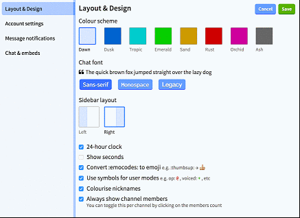
The settings screen has had an overhaul, most notably to accomodate a range of new colour schemes, a monospace font option, and a switch to move the sidebar to the left.
Next, options that used to be per-channel, like image embedding, can now be set globally.
And for those of you with too many channels to keep on top of, you can now choose to mark channels as read automatically.
We’ve also added more nickname colours, so clashes should be less common—but they can never be fully avoided. A side effect is that colour assignments will have changed.
There are lots of other little changes, let us know your favourites in our #feedback channel or on Twitter.
Oh and ask us on IRC if you’d like to be included in early beta access to these changes on mobile.